The update today from work has the number at 92 in our office. Hopefully California has hit it’s peak in number of new daily cases and people are getting the message to socially distance themselves. I’m referring to this chart from the Orange County COVID-19 Dashboard:
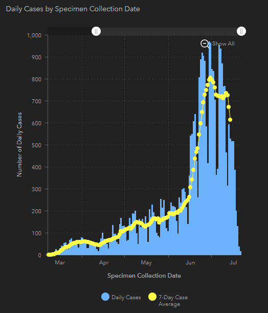
There appears to be a definite drop off in the daily reported number of cases since July. Hopefully it’s not due to the new reporting system mandated by the White House.

However, looking at this chart, it seems there is a huge fall off in the number of tests reported. Is it because less people are testing because less people have symptoms? Without knowing the criteria for testing and reporting, it’s hard to make sense of all the data. I wish there was a summary dashboard with a simple stoplight with red = stay home, yellow = exercise caution and social distancing, and green = mostly safe, plus an up/down arrow indicating if things are getting better or worse.
