I am subscribed to r/dataisbeautiful on Reddit. The purpose of the sub is to highlight examples where data is presented in a “beautiful” manner. However, like everything else on Reddit, it has devolved into using data/charts as political commentary.
For example, look at this post:

Every chart tells a story. If you look at the data presented and the use of the phrase “profited from” in the title, the obvious message is that evil oil companies are taking advantage of higher crude oil prices to gouge the rest of us for excessive profit. Instead, if you look at the entire income statement, the profit is from better utilization of fixed costs.
I pulled Q2 filings for the past six years for Exxon instead of just two. With COVID, any comparisons that do not include pre-COVID data is suspect as 2020 and 2021 are not normal years. Here is 2021/2022:
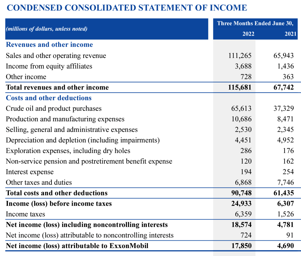
If you look at the very last line, it matches the data shown in the original chart. Let us go back a few more years:
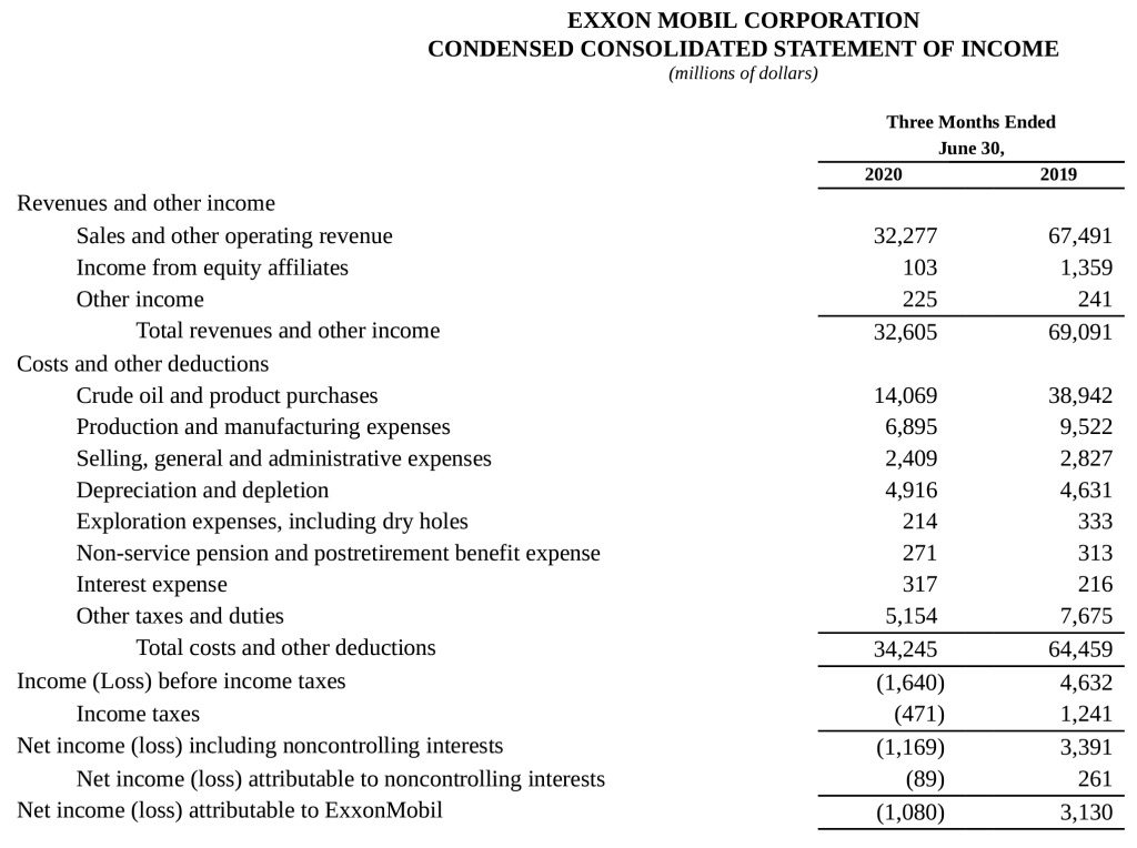

So Exxon had profits of about $3-4 billion, the lost $2 billion, made $5 billion in 2021, then a whopping $18 billion in 2022. Bastard!
However, if you look at the line detail and calculate the gross profit margin (total revenue versus cost of oil and product purchases, it looks like this:
| Year | Gross Margin |
| 2017 | 48.0% |
| 2018 | 43.8% |
| 2019 | 43.6% |
| 2020 | 56.9% |
| 2021 | 44.9% |
| 2022 | 43.3% |
From this data, 2022 has the worst Q2 gross margins for the past six years. Or in other words, as raw material prices increased, Exxon raised their prices less than in prior years. It is a simplification, but many businesses try to keep a steady or increasing gross margin percentage over time. Then where did the operating profit come from? Look at the next three lines in the income statement, especially for 2022/2021. Even though raw material prices and/or unit volume increased, the actual production and SG&A costs did not. This makes sense since it takes the same amount of work to produce and sell a unit of product regardless of whether it costs $1 or $10. You can see the reverse of this in 2020 when sales dropped enormously due to COVID. Exxon still must pay for all the production facilities and employees, so they had a loss for Q2 of that year.
Since I work in finance, I have been making slides and writing commentary for almost thirty years. If we are providing unbiased internal reporting and I get this from my staff, I would be extremely disappointed. If my goal is political commentary, then this is a great chart since it has just enough truth to push a biased agenda.
==========
In this case, I do not know what people expect Exxon to do. Drop their gross margin targets to lower prices to the consumer? This may trigger more demand, and depending on their production capacity, may require more capital investments. These costs are hard to scale back when there is a downturn, which means greater losses during those periods. I do not know if Exxon laid off employees during 2020, but companies are made up of people. Any taxes or price controls, whether we feel is justified or not, does have a direct impact on the company’s employees and its customers.
