Google sent me a notification today that my May 2021 timeline is available, whatever that means. So I went to Google Maps and selected Timeline to see how Google tracks my movement 24/7 (or my iPhone anyway). I then compared last month to May 2020. Not surprisingly, there are a lot more dots on the 2021 map.
This is May 2020:
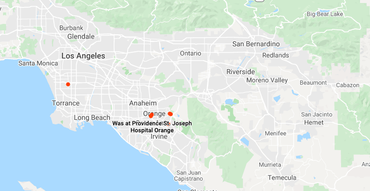
The dots are: home, work (probably when I “stole” my 30″ monitor), St. Joseph hospital/dialysis center, my sister’s house, and a local Tesla Supercharger. There is also a dot in a in a nearby park, but I do not remember that. This was early in the lockdown so I am almost certain the parking lot gate was locked.
Here is May 2021:
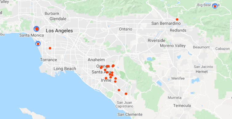
Same dots as May 2020, but a lot more, including UCLA (post-transplant), dentist, other medical appointments, markets, and outdoor food courts for church cell group. The dot in the upper right is the Big Bear trip from last weekend. That is the furthest I have been from my house in about two years. Pretty sad. It is only four days into June and the timeline map already has more dots than May 2020. Another sign that maybe life is slowly returning to normal.
